F.A.C.T.S - The Five Core Principles of a Great Drawing or Painting.
We all love an acronym because it helps us remember complex theories. Since I started teaching Travel Sketching at LaSalle College of the Arts, I've slowly developed this acronym after a few years of repeatedly refining the curriculum so students get the best possible lessons.
It started as FACT, and then the S got added, and the T was originally Trust, as in we must trust ourselves, but now I've changed it to mean Texture, so let me just give you the quick rundown before I go into individual letters in depth.
F.A.C.T.S. translates to Focal Point, Asymmetrical Balance, Contrast, Texture, and Story.
These are, in my opinion, the elements, the ingredients, the tools, the underpinning of a good sketch. If your sketch and painting has all the FACTS, it will without fail be a good sketch, and a good painting.
If your sketch or painting has only one or two of the FACTS elements, you might get a good sketch, but it won't feel brilliant — it is just fine, FINE can translate to missing something but we don’t know what.
If a sketch has good contrast, it will communicate the illusion of 3 dimension, but if it has no focal point, nor a clear story, and missing variety of textures, I think it'll look mediocre.
F for FOCAL POINT
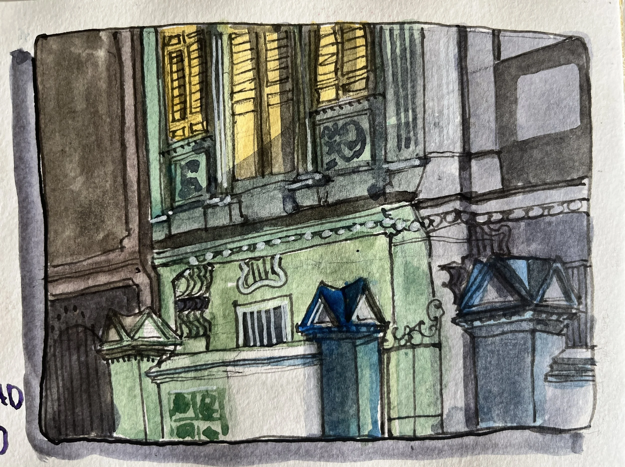
A mediocre example from my sketchbook no. 23. Blair Road Shophouse;
This sketch is objectively fine, from the perspective of a detailed sketch — you sort of make out that it's a cropped bit of a shophouse, a front wall, a gate, and a yellow window pane on the second floor, even a little bit of shadow. Yet ultimately your eyes hover between the center wall and the window, because there's no obvious focal point.
A for ASYMMETRICAL balance
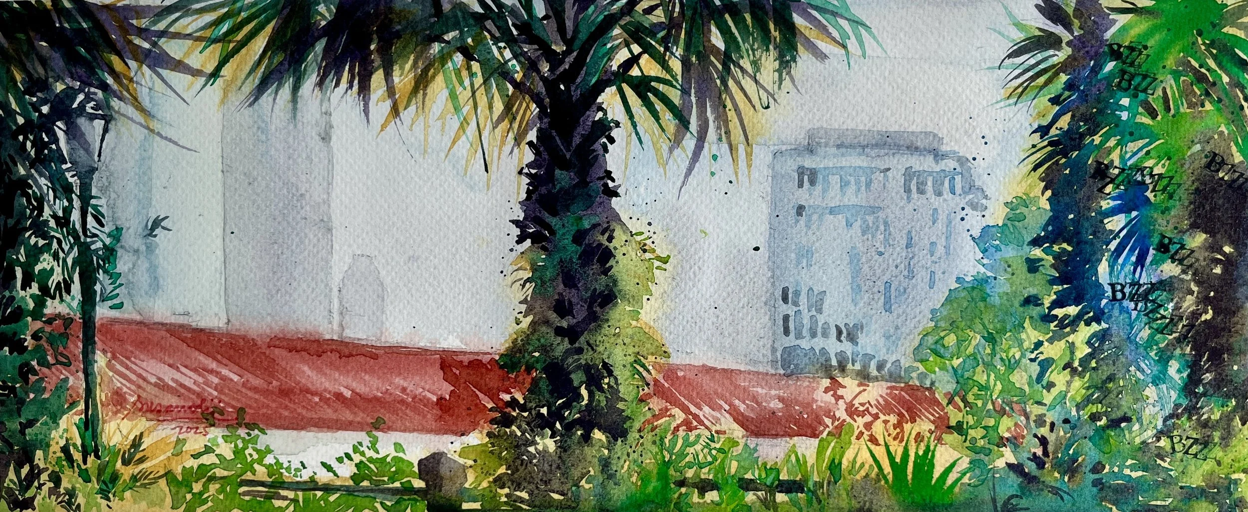
In basic design principles, we talk about balance — where you place a subject or object can dramatically affect the composition. When sketching or painting travel subjects, we're depicting a version of what's at that location. I argue that asymmetrical balance in any composition of travel subjects guarantees your sketch will be interesting to look at.
Exaggeration is part of asymmetrical balance. When we push colors, shapes, lines, angles, and values further, we get contrast. We might discover a surprise focal point. We create dynamic visualization. Contrast — or Chiaroscuro — is what I often refer to as Drama. Drama, too, is an exaggeration in angle, shape, or color that can add immense intensity to a sketch.
C for CONTRAST
Contrast — or Chiaroscuro — is what I often refer to as Drama. Drama, too, is an exaggeration in angle, shape, or color that can add immense intensity to a sketch.
This is one of the hardest elements to master. Many artists and teachers will tell you: it's something our eyes don't naturally see until we have done lots of sketches that have very low contrast — in other words, flat, and does not pop.
As a painter, over the years, I tend to feel through my contrast, adding it either using layers gradually or going very dark first and adding light, depending on what medium I'm using. In art schools or basic art classes, this is called knowing your value range, grayscales, the dark and the light. Quite boring but necessary.
In the Italian Renaissance, they called it Chiaroscuro — a dramatic contrast between dark and light, as if our sketches are always done in strong lighting, strong sunlight, or at night with a strong spotlight. This creates intensity and dimensionality that is unparalleled.
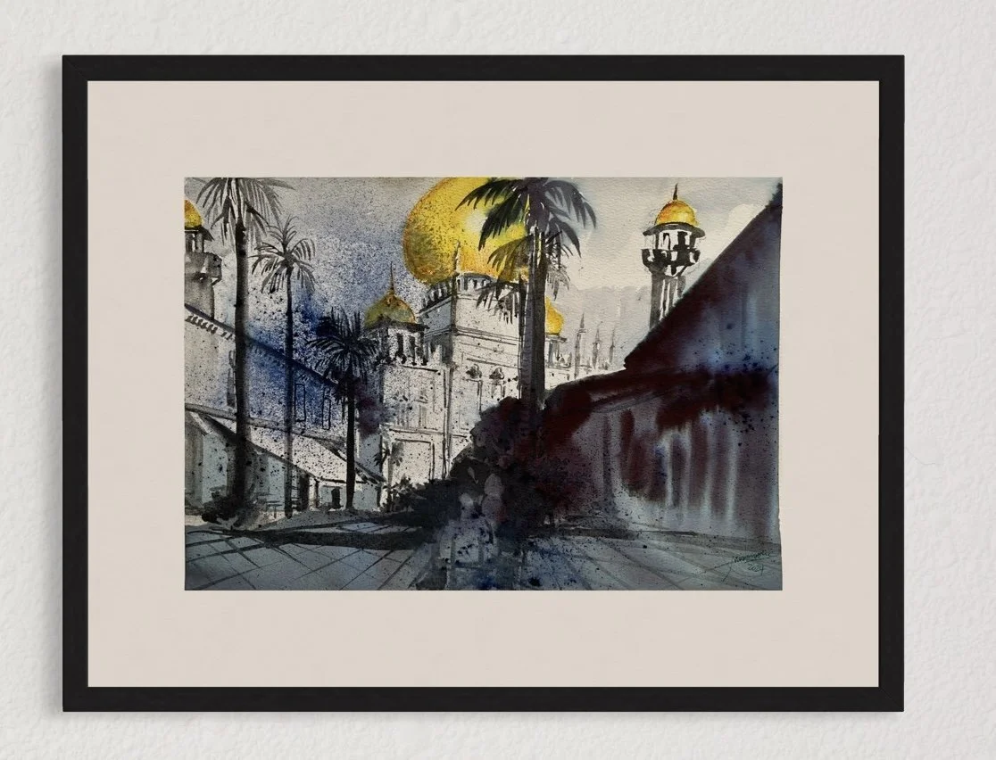
Using limited colours, the dramatic effect of the dark accentuated the golden mosque domes in this watercolour of Sultan Mosque.
T for. TEXTURES
This is one of my strongest and arguably favorite elements — something I've practiced for years as I teach and work as an artist.
Textures can be made with lines or shapes, and when used together, they add life, movement, and vibrancy to your sketch. The way I learned to create varieties of textures is purely through play and experimentation. Students often find this hard to do when they're not used to playing with their tools or are impatiently copying.
Brush strokes as textures can be traced back as far as Chinese calligraphy, where the forms and shapes made with a Chinese brush enhance the meaning of the characters. A Chinese brush has a softness that allows ink to flow based on movement and pressure. The lightness and pressure of brush strokes, along with how much liquid or paint distributes evenly or unevenly, are just some of the considerations when creating textures.
Sometimes a single stroke can be both hard and soft, light and dark. The edges can be a combination of hard and lost.
Texture-making is a whole and big part of visual language that everyone can develop and build into their painting technique vocabulary. The more variety of textures you can create — with all different mediums, from dry to wet, pencil to ink, watercolor to markers — the more your sketches and paintings will sing.

Pencil practice I did as a piece of art you can use as both a reference image and inspiration

Brush and spray method to create textures and vibrancy I am known for.
S for STORY
Sometimes a place, a building, or a subject holds its own story without us having to tell it — like that antique shop on Craig Road with a big banner that reads : we buy junk and sell antique. Its a memorable place.
Sometimes our travel journey, captured with just pen and pencil, without color, becomes a rich story when we use script or text.
Sometimes we're drawn to something we can't quite explain, and we don’t quite know why we are drawn to that. The story can be a more personal, and we don't always have to share those sketches publicly. Story it still is. Our story.
Sometimes story is a series of observations: a page full of different types of chilies in a Peruvian market, or various hands and feet sketched on a boat in Japan. I am drawing from my own sketch book experiences here.
Story unfolds differently every time on a sketchbook page. Our drawing skills is so that they are told sincerely, and expressed uniquely.
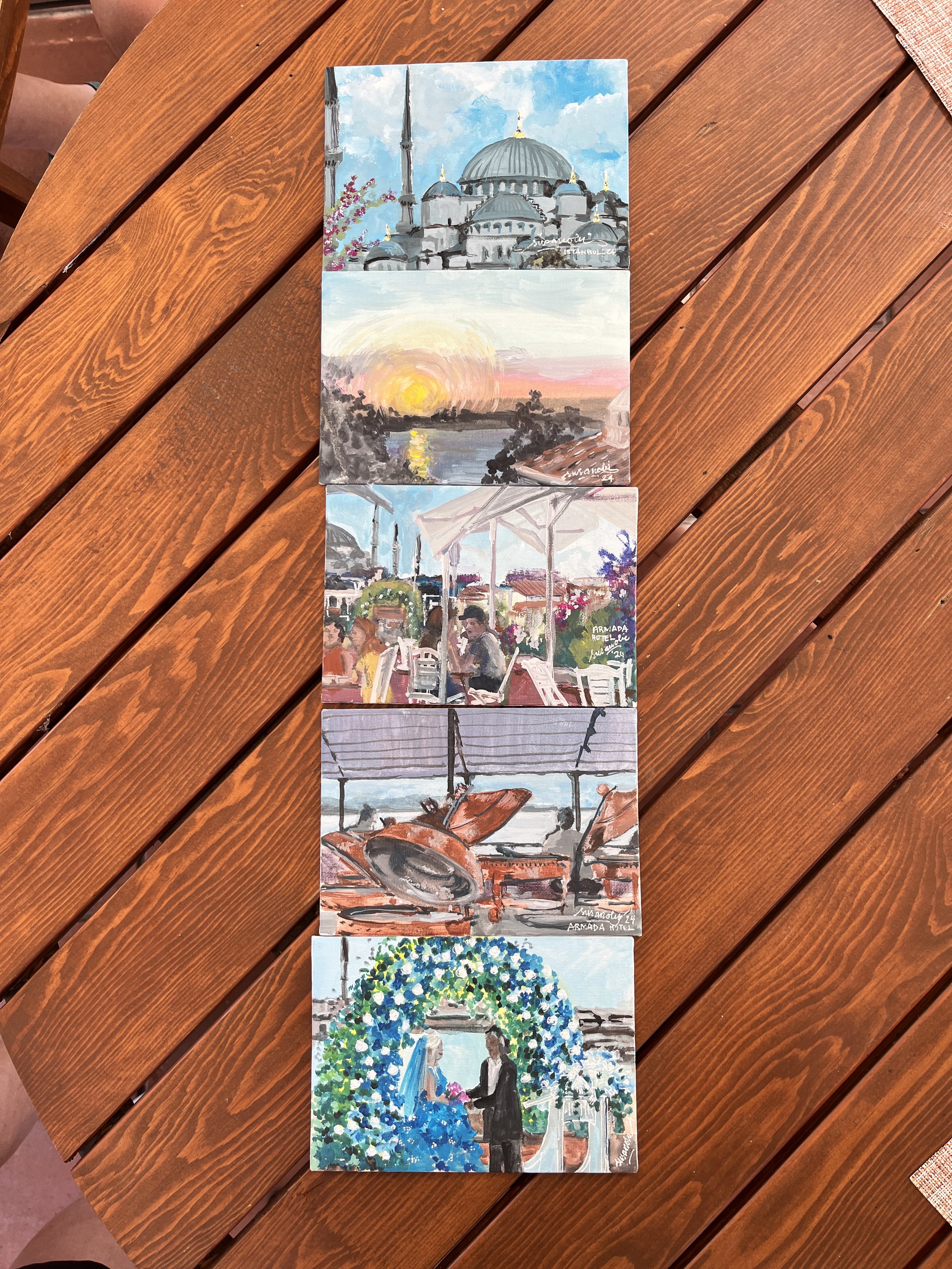
An example of a series of small paintings I did during our friend’s wedding in Istanbul, Turkey, shows a through line of the sun rising over the Mediterranean Sea , friends gathering over breakfast, the days leading up to the wedding party, where the bride wore the most beautiful turquoise tule wedding dress by Kei Ninomiya and pointy silver shoes by Bottega Veneta, both echoing the skies above Haggia Sophia.
Bringing It All Together
If you have all five of these principles, without fail, you will have a good sketch.
A question one student asked was: "If I don't have all five principle, depending on my subject, which one of the five principles is a must-have?"
I would say this to them: This is not about ‘correct’ or ‘optimised action’. FACTS is a tool to bring your point of view out brilliantly. Noticing what you can enhance, exaggerate, dramatise on paper or canvas, will be the ultimate powerful skill as visual artists.
When all five FACTS elements work together — focal point, asymmetrical balance, contrast, texture, and story — your travel sketches transform from simple drawings into compelling visual narratives. It’s not scientific correct principles that once you get, you will always get, it is tools to work with your own creative judgements. And it needs practice to master.
Start by focusing on one element, then gradually notice which of them are lacking the most in your habit to compose, and slowly you will develop your own FACTS priorities.
Try it. Here’s how:
Look at a sketch or drawing you’ve done that you feel is a bit flat, bland.
Apply one of these principles, or more. Gradually create a few new sketches based on FACTS.Which element do you find most challenging? Which one comes most naturally to you?
Join my IG community or WhatsApp community, and share your thoughts.