Watercolours for Beginners Mind : Lesson 1 is Consistency
The question is never how much paint should I use, it’s always how much water should I use. While this make logical sense to ask, it’s not really helpful to a new student of watercolor, because watercolor is fluid, and could not be scientifically measured. Using watercolour means allowing a lot of lost, illogical, wtf moments, it is here where intuition can be cultivated, and a sense of wonder can help us create beauty.
If you’ve read this far, you’ll realise that you’ve already forgotten all the things you just learned last night, and that’s absolutely fine. Learning watercolor by doing is what this course is about, because even when you see me demonstrate it, there is no way you can have the same exact result , so you doing it is going to teach you, thus as Lao Tzu once said, “Forget everything, and discover something quite new and different moment after moment,… As long as we have some definite idea about the past or some hope in the future, we cannot be serious with the moment that exists right now.”
The concept of ISH. ‘Agak-agak’ in Malay or ‘Kira-kira in Bahasa’, Mas O Menos in Spanish, which all translates to’ roughly’ is what we want to embrace and love this week.
Too much water added to a touch of paint. Mixed on the palette, feels runny and diluted = Tea
Equal amount-ish of water to paint. Mixed on the palette, this is runny but vibrant, and when loaded on the brush, this feels heavy, but not drippy. if it drips, press the brush to the side of your water bowl to reduce water = Coffee
A lot more paint than water. Mixed on the palette, glossy, milky, less transparent = Milk
Wet brush directly on pan or paint, no visible juiciness, when mixed on palette, its creamy, thick and globby = Cream
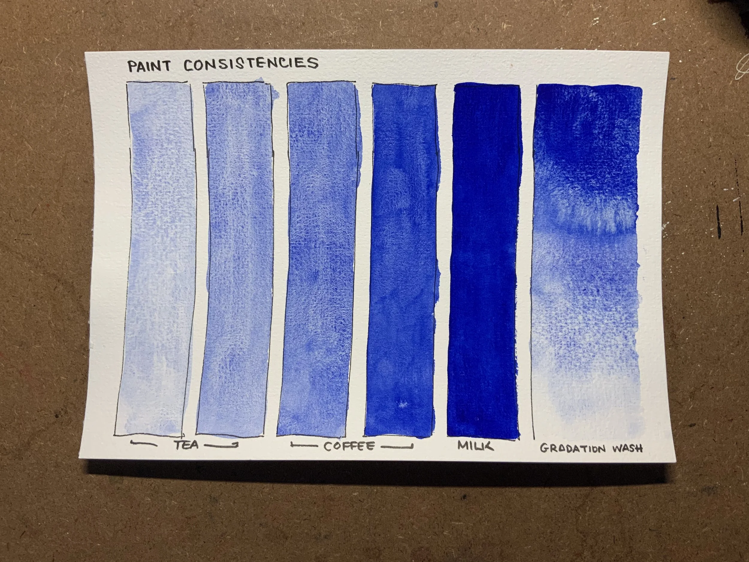
Colour used: Granulated Ultramarine
Once you’ve done the above instruction, you’ve got yourself the 4 basic consistencies of watercolor in a rough nutshell. It’s important to note that Tea, Coffee, Milk and Cream all have spectrum within each of nuanced consistency. So your job as the captain of your studentship is to play with these consistencies so you can repeat them with greater confidence.
For your own work, we started to sketch a street scene at sunset, and the focus here is to do more than one painting of the same reference and for each ones to teach you something different. Focusing on watercolor consistency, see if you can feel your way through the paint mix. I choose this reference because it’s actually not a strictly beginners reference, we are using our beginners mind to attempt what looks like a challenging image, but it is actually a great image to test our command of paint consistency. You have to think of the details as the least important.

Week 1 Image Reference for practice. Looks really complex, but is not when you think only in watercolor consistency :)
Image comes from Pinterest.
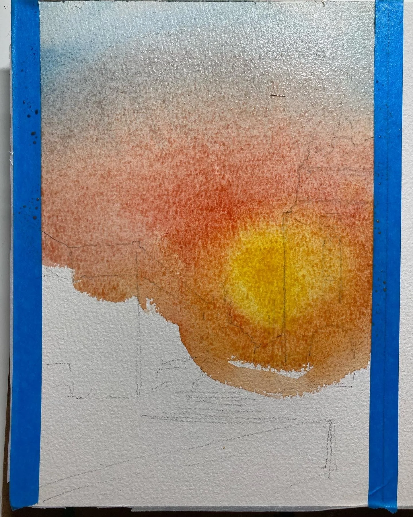
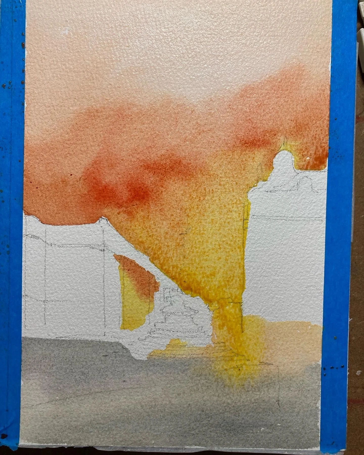
This is a mix of diluted colours, placed strategically where the center of the sunset is, behind the foreground structure. The blue is the most weak in color and is added last. Leave to dry completely to move to the next layer.
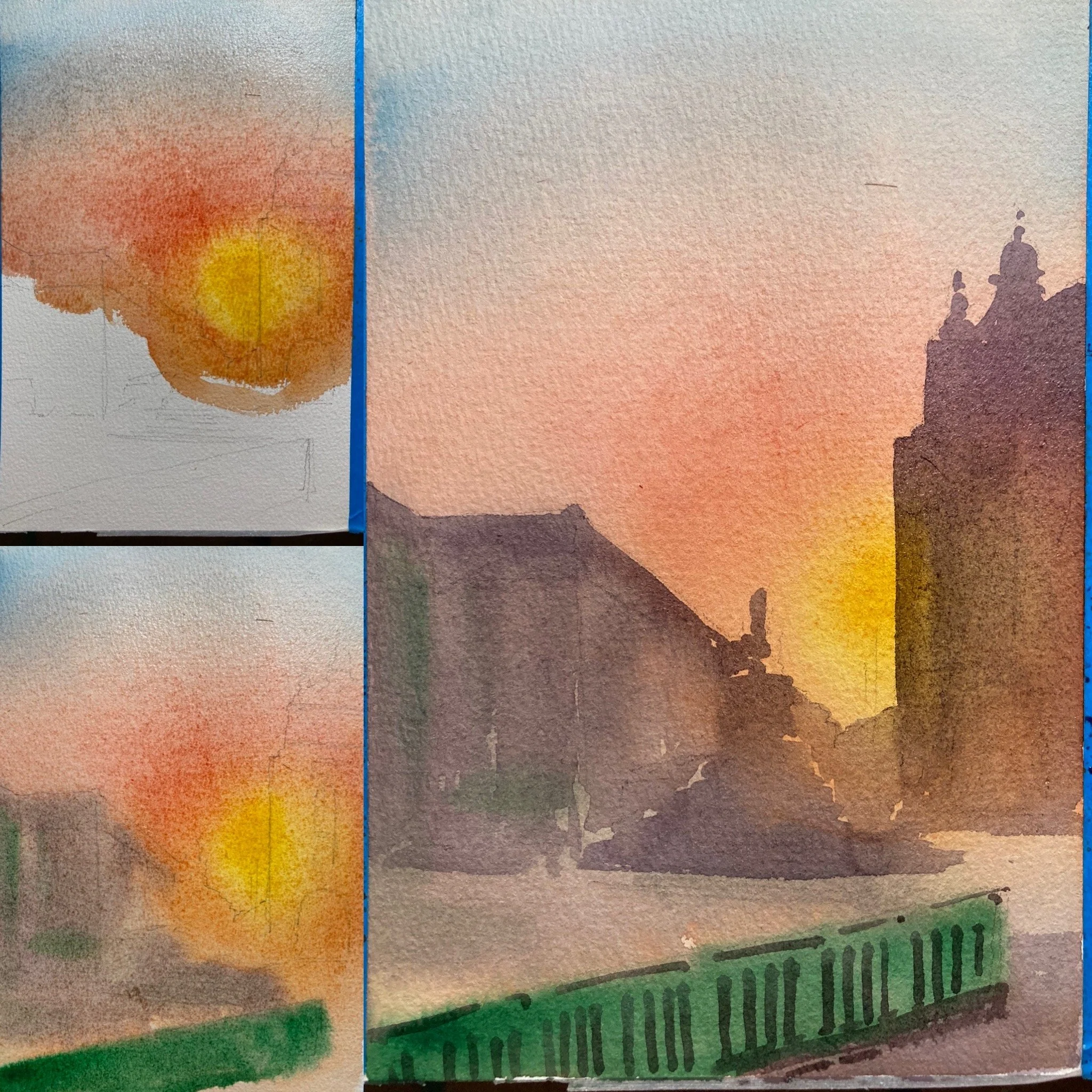
The image on the left bottom is what I did next. While the top is drying, the bottom I wash with a tea consistency of bluish grey, I like this contrast of warm and cool.And then I waited until that dries, before adding a clean big foreground grey shapes. Notice that the grey is not all even, some of the yellow is still coming through,….its because the consistency of the watercolour is still at coffee. A stronger coffee at the top of course).
Here’s the second attempt. Notice how differently I started. I went bold and painting the skies and the ground below while avoiding the buildings.
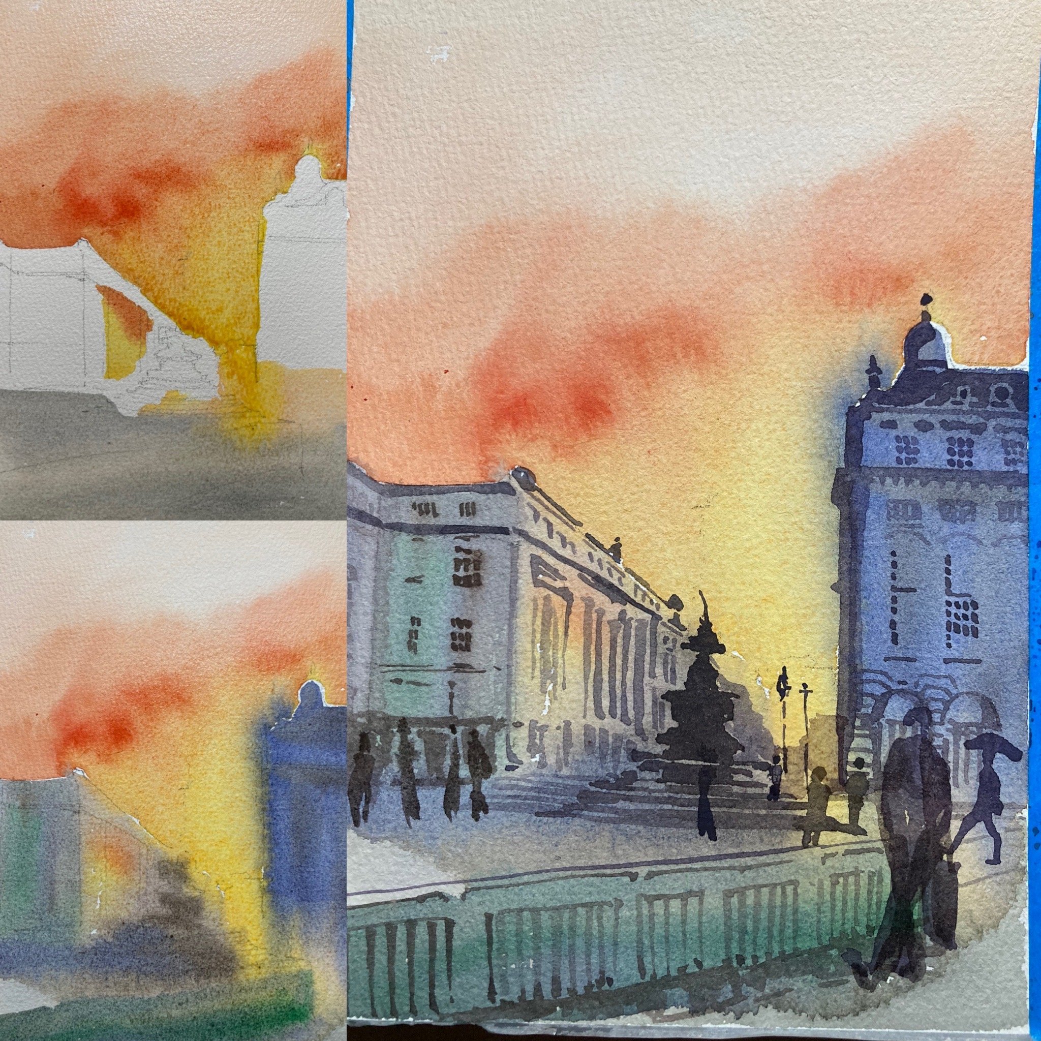
And then Left bottom, I added the foreground building layer in quite diluted grey. and the building on the right, a darker coffee consistency of blue. The skies looks on fire.
Once that layer is completely dry, I added the strong coffee details to the buildings, and then a milk consistency to the people & the fountain.
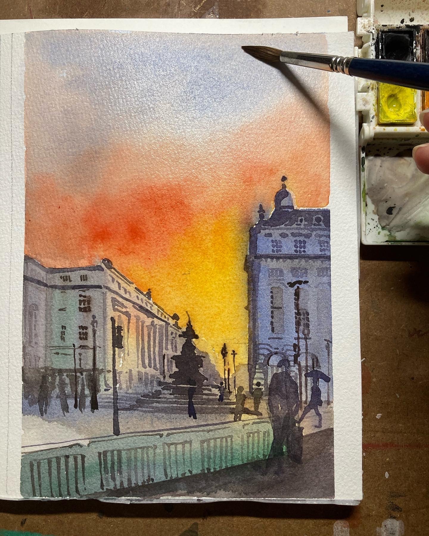
THIS IS LOOKING GREAT NOW, I thought to myself.
At this point, whatever the result is is not as important as the steps you took to get there. The process is so fun and exhilarating for me, like a roller coaster.
Enjoy the process, the mistakes, the joy of paint gliding through your paper.
Susan