Urban Watercolours_ Section 1 about Colour Matching
This is my course notes for a short course I run called Urban Watercolours, I thought that publishing my notes will be helpful to students who are currently in the course in case they want to return and refresh their learning anytime afterwards, and for those who are not in the course, just reading these notes may have some benefits too.
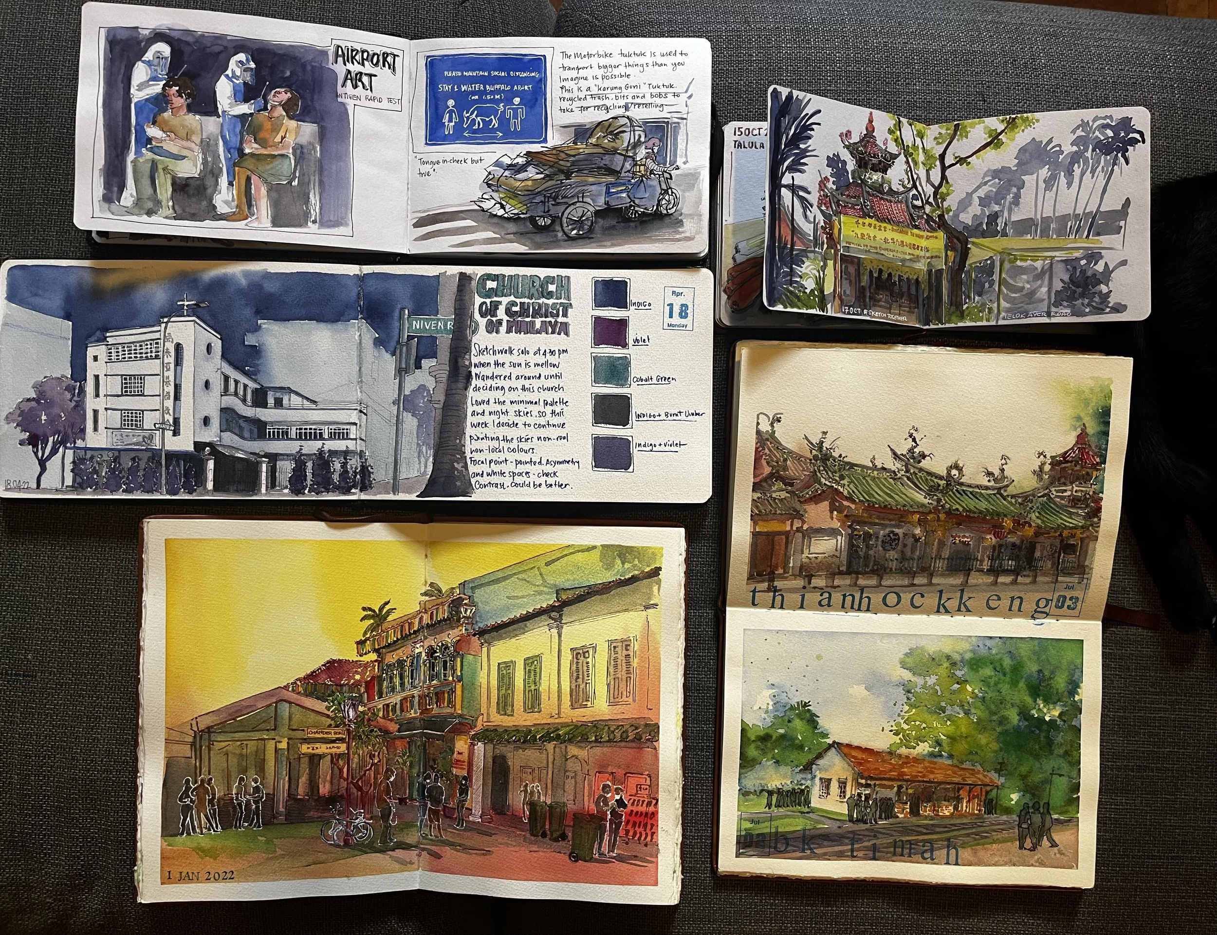
All these sketches are focused on strong colour and compositions
COLOURS AND COMPOSITION
To get the most favourable outcome tailored specifically to your improvement goals, image references will be a very important support tool. We will cover how to mix colours based on temperature and mood, and colour matching to the subjects and objects so that you can accurately depict your urban scenes with good strong values.
In this process of learning colours, we will also continue to forge the practice of using continuous lines and unified shapes into your skillset.
Drawing practice recommendation:
Use this Pinterest board to access drawing subjects and references mentioned in the course:
I recommend to draw as much as possible using references available in your current location. (Example: coffee cups, cafe interior, people) using only Continuous lines, and/or Unified shape Alla Prima to improve your speed and consistency.
Asking ourselves the question of ‘What are my improvement process goals? instead of result goals is more effective, less stressful and a more fun way to learn in my experience.
Process-driven goals means you focus on how you do the work, not the end result. This is a shift in the way we usually set goals in other parts of our lives, that it will need some time to learn.
An example of a question I would ask myself: “In 8 weekends, what is realistic that stretches me out of my comfort zone but not overwhelming that I couldn’t reach favourable outcome?”
Here are some examples of process- driven goals:
I want to improve my confidence in using wet on wet technique.
I want to improve my minimal Alla Prima technique.
I want to focus my energy on seeing values and painting 1 to 5 values
I want to do 8 thumbnails working on water consistency and layering
You will embark on Self-driven Projects where we will go to locations together with your classmates and you will work on goals that you set for yourself based on the week’s topic and we will spend the last 30 minutes reviewing our works together in our Show & Tell throw down. Please remember that your goals is not set in stone, and you can change your mind anytime, adjust your process goals as needed, but definitely have a plan and direction before you begin! Working without a goal, I am sure you know, is an unproductive use of good energy.
For those who has a hard time with commitments, you could try having a commitment device, this can be stating outloud to your partner/friend ‘ my process goal is xyz’ so she/he hears it and they can help hold you accountable for it later.
Or you can write a self-declaration on your phone notes or email me, or yourself this:
Self- Commitment contract example :
My Sketch Walk Improvement Goal Declaration
I,…………….(insert name), ideally want to improve and master ALL skills and overcome all my shortcomings in this course, but focusing on one problem at a time is more reasonable for the head space, energy and expectations I have of myself.
I think I need ………. (days/pages/hours) to fully absorb. ……………………. techniques,
I can always change course whenever I want. But I commit to practice ………………….. techniques for ………. (days/pages/hours) before I move on to another.
I also will remember to have fun, and not be too hard on myself because fun will help me remember and learn skills easier.
Let’s do this! Thank you for this, (insert your name)
Sign off (name)
=============================================================
Seeing and Matching Colours.
Colour matching is not necessarily a skill everyone has to have, but the goal in the practice of matching colours is to improve our seeing skills and our mixing watercolour paint skills goes along with that. This improves the way our watercolour paintings looks.
When we see colours to try to match it, we are effectively looking at the value of that colour, and then the temperature, which we will cover in week 3.
In the next 4 weeks, you will work on finding your new comfort zones using simple tools I’ve deviced, and pushing past your old comfort zones to form your own working style that sings and shouts for you.
Colour temperature is a matter of seeing first, then finding the words that you can use to mix the paint colours you see.
In this course, we use limited palette as much as possible, simply to avoid confusion. If you can think of colours as just values and temperatures, dark and light shadows, warm and cool, the focus becomes clearer. In painting, in my opinion, there is no such thing as pure colour, all paints has a shade that tends towards warm or towards cool.
“Values does all the work, colour gets all the credit” - Ian Roberts
Let us look at this closely. When watercolour paint is wet and when dry, there will be a slight difference, right? Can you identify the values and the temperature difference if any, make your notes. The standard is that dry watercolour is lighter than wet watercolours, so we have to make some compensation for it to get the values we want when dry. (see pic at the bottom of this page)
When colour temperature on two different colours is more harmonious, they hv the same temperature. Check it out by doing some colour swatch test, and putting the Temperature checker against the swatches.
The other tool I make myself is the Thumbnail color-finder, sometimes I cut a long slit through the middle or a square, and I use this to colour match by comparing the image to the paint I am mixing right on the thumbnail.
These Lighting temperature will affect how your reference and image look.
Overtime your eyes will get used to seeing temperatures and values that you won’t be needing these tools.
When painting shadow values, versus the shadows you see, you have the options to change its temperature.
As long as the value gives enough contrast, the colour temperature of the shadows can vary, they can even be splotchy as seen above, it creates a beautiful effect that gives the painting more dynamism and life.
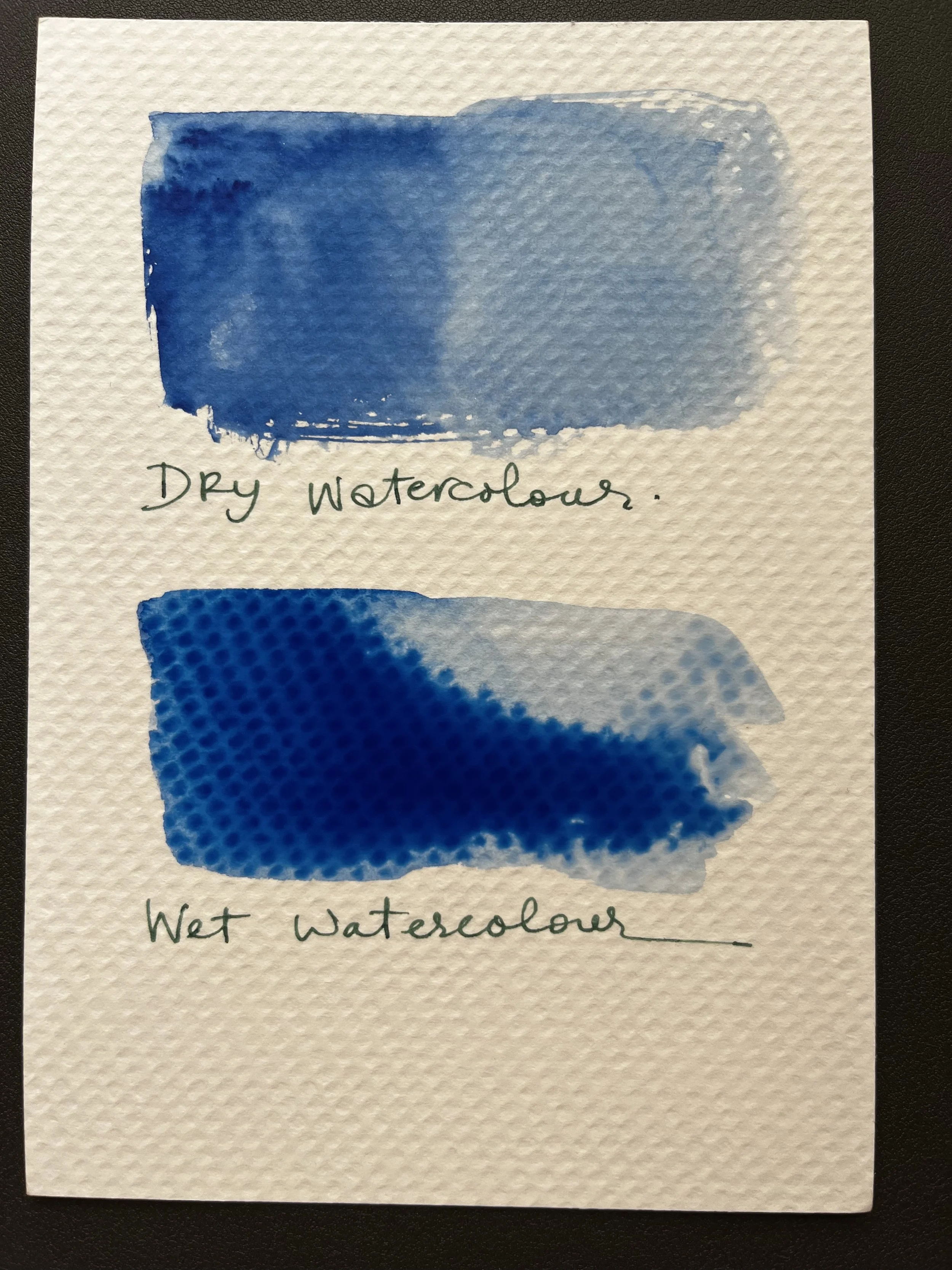
Dry and Wet watercolours has different values!
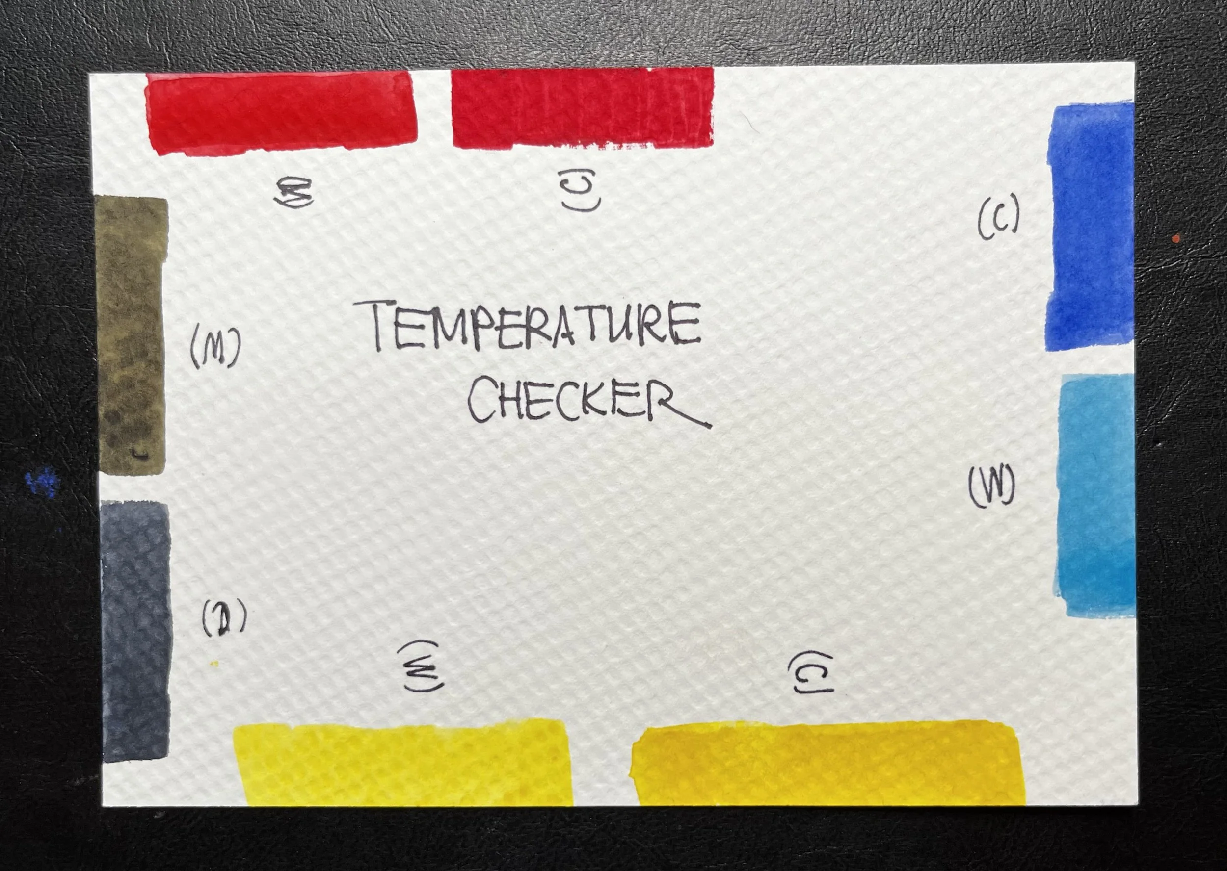
Temperature checker on watercolour paper
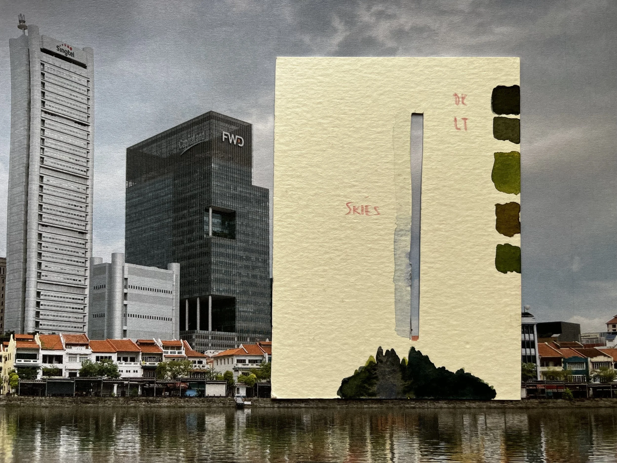
Thumbnail Color finder - you can make yourself using watercolour paper