Watercolour for Beginners Mind - Week 4 is the one about colours
This week we’re going to play boldly with colours. I discovered that playing with colours can be more effective to understanding color mixing and temperature of paint than a strict color wheel exercise. Conscious playing is excellent for this week’s topic.

Just for reference, this is my dirty color wheel.
Let’s go!
Two things we will do today is to paint-a-long and to observe the colours and the way paint mix, or rather the way YOU mix and apply the paint on the paper.
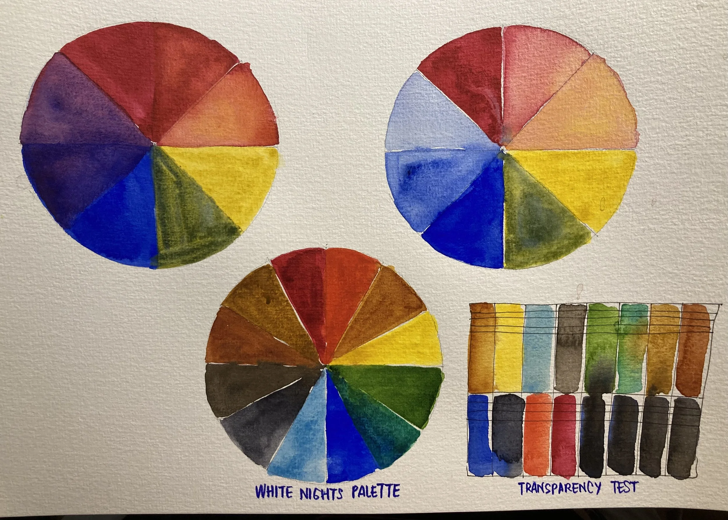
Color wheels I made previously, using White Nights paints.
A reminder,
You learn the most from your own mistakes. So if you are thinking about producing excellent outcomes and to make no mistakes. Think again, refresh your thought browser and remember, if you try to make no mistakes, you will be frustrated, and this class will not be worth your time.
In this class, what i am covering is by and large just the tip of the iceberg of what is called Colour Theory. For the purpose of brevity, I will cover only two big theories. The theory of cool and warm colors and why watercolour artists uses this a lot, and how to mix colours to get varieties of darks that avoids using black.
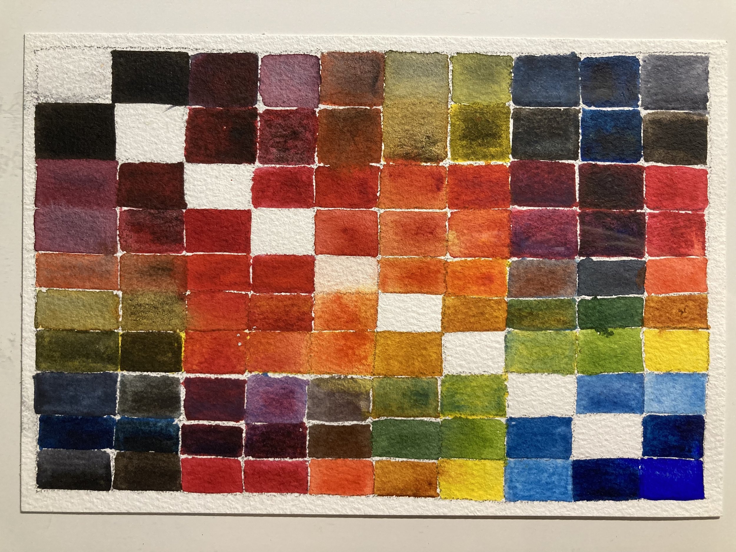
One of my hundreds of colour exercises, where I am testing temperatures of my paints ( to be honest, this is still quite confusing sometimes.)
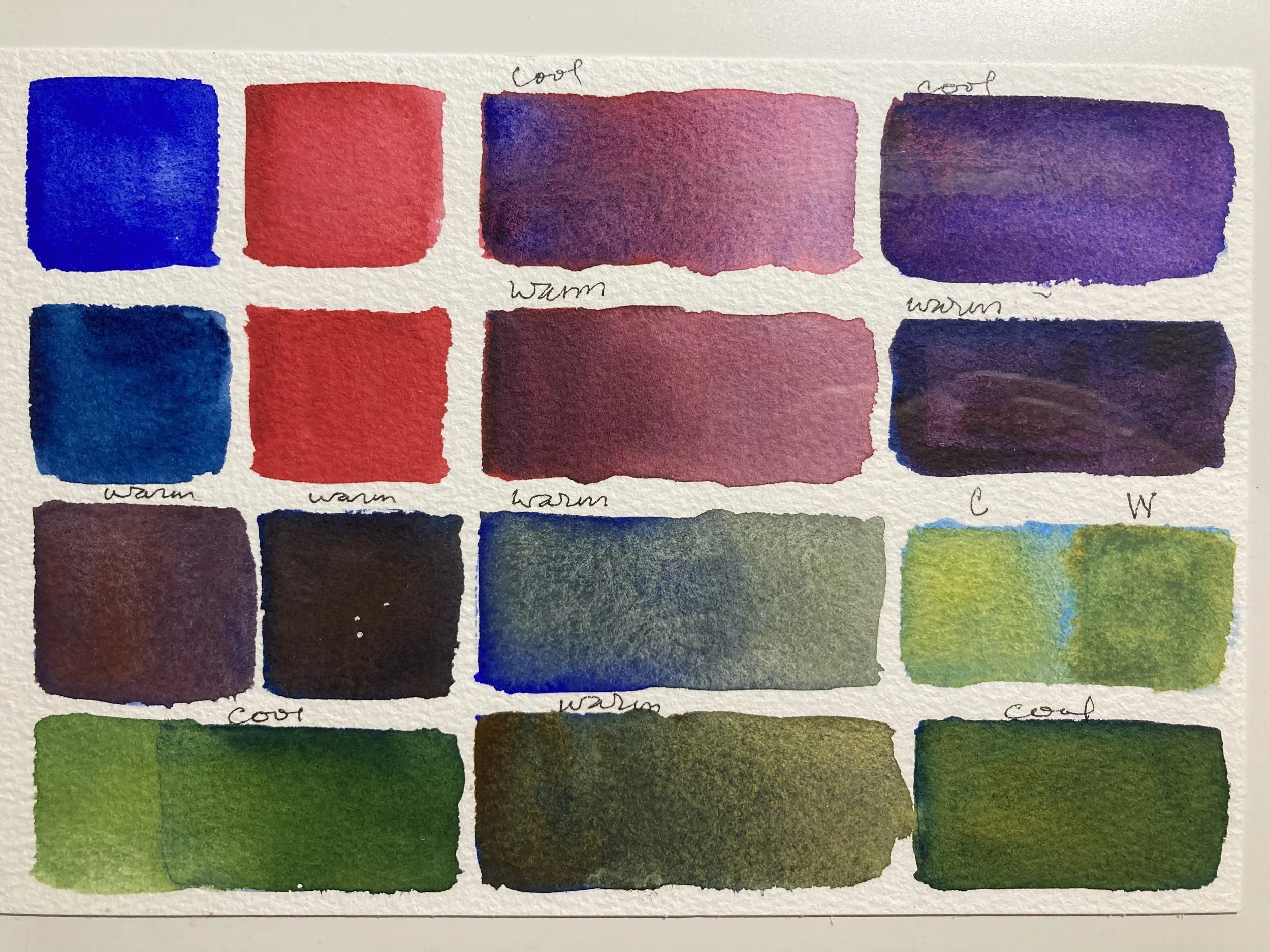
When it comes to warm or cool colours, don’t believe what anyone or brand tells you, believe in your own perception. Some brand of paints are slightly warmer, slightly cooler when they bare exactly the same colour name. Sometimes your mix will go either direction and there’s no way anyone else can tell you, you’re right or wrong. Paint mixing is a very subjective activity so your practice here is to identify the colour temperature based on your own eyes. Over time, your own natural ability to detect the temperature of colours will guide your watercolor painting.
If you look at works by Thomas Schaller, you will see how undetectable his mixing of colours, but the majority of the temperature of his paintings uses both cool and warm.
Another artist I love to watch is Alvaro Castagnet, you will see that his way of painting is very bold, daring and his strokes are really lively. in his word “ art is the perfect imperfection”.
In this Pinterest board, one piece of work from both artists are pinned, and when you click the pin, you’ll be shown others like it. Spend some time looking at these types of watercolour works simply from the way they use colours. (And ofcourse you cannot ignore their use of edge, and strokes, and consistency and all the other stuff we learned in previous weeks, but for this class, just look at the way colours is depicted).
And this Short video shows Alvaro Castagnet’s demonstrating one of his paintings, and enjoy getting a boost of inspiration from just watching how he does it.
Back in the classroom now, I will recommend using more than one brush, one brush for warm colours, one brush for cool. This way the likelihood of contamination is reduced. If your paints are contaminated with unexpected colours, that’s not a big deal, but for the purpose of this class, I will suggest two brushes so we are less likely to get distracted by unwanted mixes.
Warm colours usually has some yellow bias in the pigment, and Cool colours has blue bias in the pigment. This is important for us to know when we want to mix bright colours or dull colours. That is essentially what Cool and Warm temperature appears to us. Two colours with a yellow bias will be warmer, duller and two colours, one with blue bias, and the other with yellow will be cooler but will remain dull. If you want brighter colours, cool colours with blue biases will always give you a brighter effect.
We’re going to paint stacks of stones. They are ideal for learning colours without worrying about complex shapes and details. And the addition of darker values for shadows will add depth to the stones and make your exercise pages as well as give us plenty of opportunity to learn about shadow mixes.
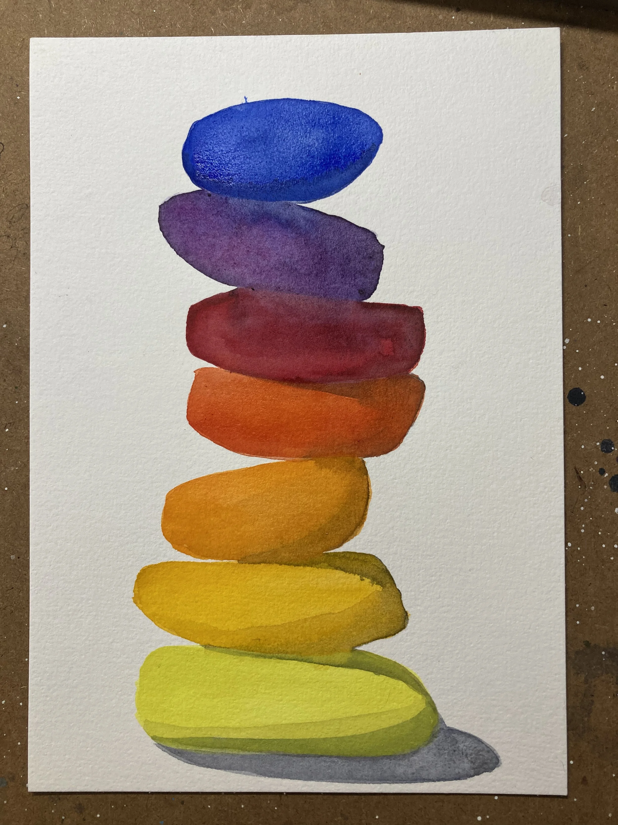
Warm colours and a neutral grey for shadows
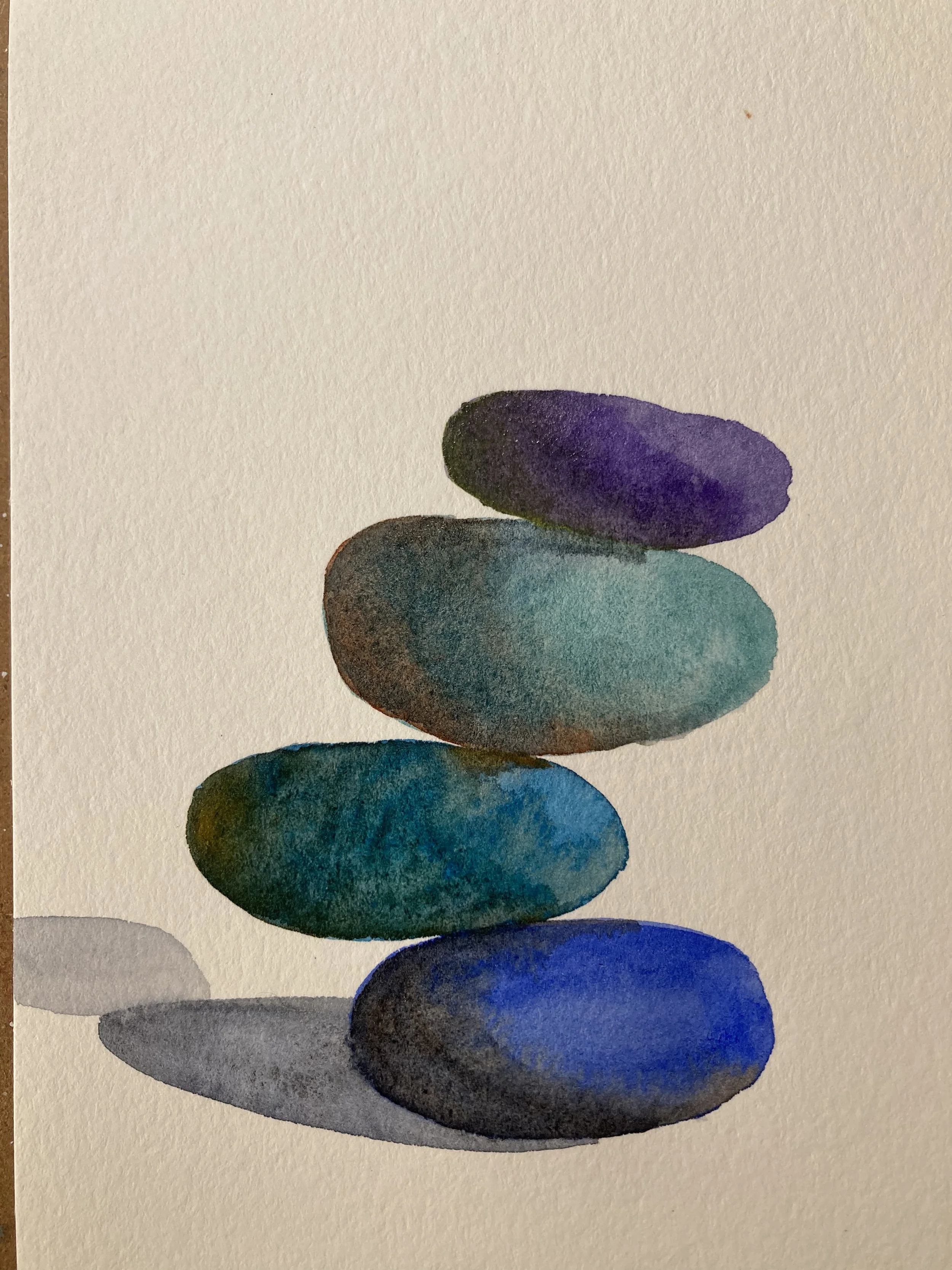
Cool Colours and their complimentary mixed for shadows
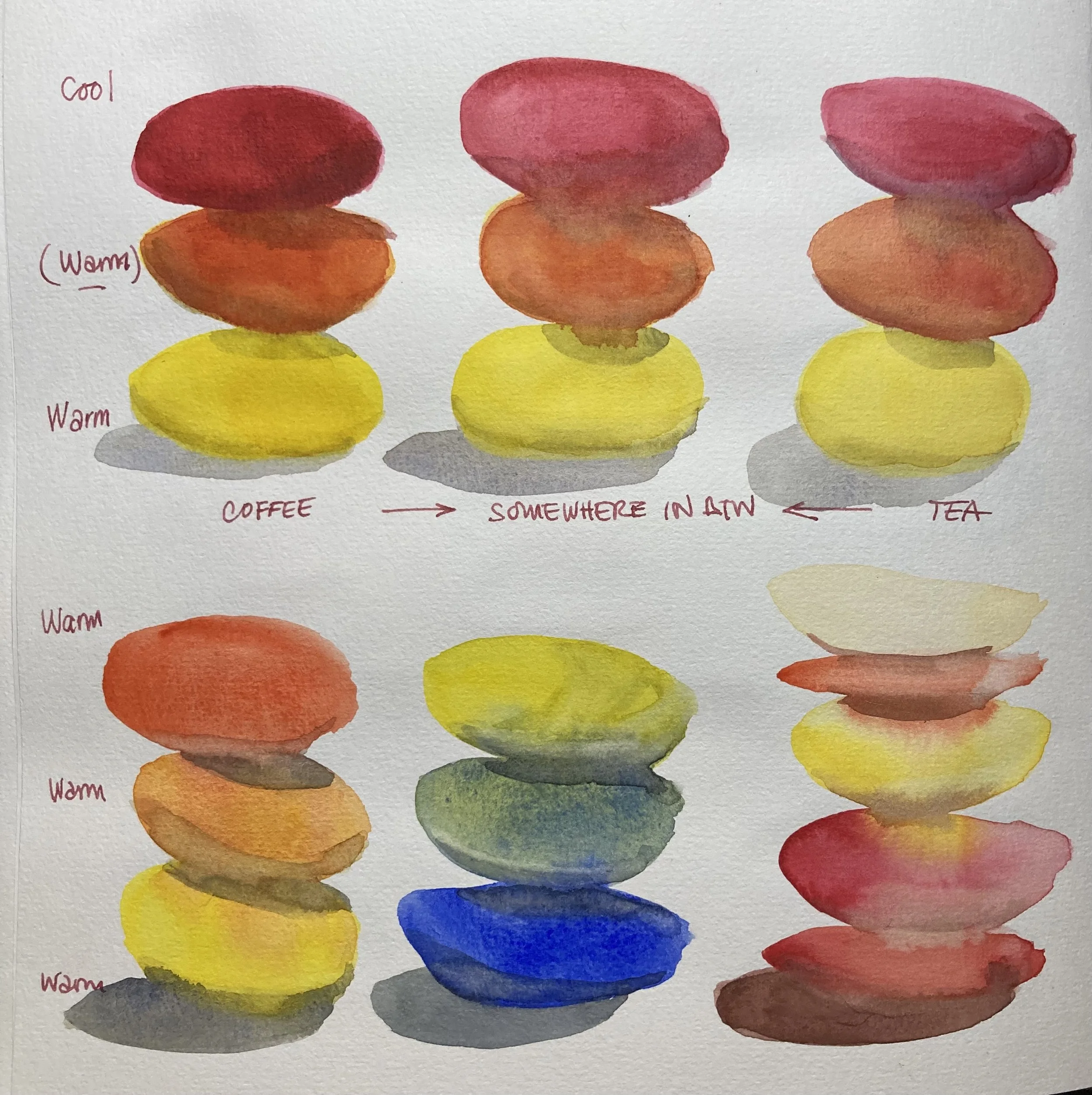
Tone and Shade.
This is the two addition in a colour wheels that we can include for Watercolours. There’s a third one called tint, but that doesn’t apply for Watercolours because tint means adding white, and in Watercolours we don’t tend to add white instead we leave white as the paper.

Tone is when you add grey into the pure colour, and Shade is when you add black. In the context of watercolour, Tone is diluted black, or what I call the tea mixture, and Shade is a coffee consistency of black. So the next question is does this apply to other ‘dark’ colours if we don’t want to use black or want to mix our own dark?
Yes, definitely we can apply non-black darks as tone and shade, and it works best when we are applying the tone and shade as a glaze. In creating shadows, its always important to let the first layer dry completely. I am guilty for rushing all the time and plenty examples of this can be seen in my practice pages.
Here are some examples of rushed painting before each layer dry. They’re still fun to do, but not as neat.
What’s a glaze? It’s when you add a thin film of paint on top of already dry undercoat, and this is what watercolourist do to add shadows and darker values to add three dimensional shape and contrast to paintings.
A glaze is just another layer on top of already dry layer. If you add a layer on top of a still wet layer, that’s called wet on wet, and not a glaze.

Primary to secondary colour stone stacks.
So now lets get into mixing dark colours without adding black.
The basic 12 colour palette usually comes with three brown hues, a dark brown (burnt Umber), medium brown (Burnt Sienna) and a light brown (Yellow Ochre). These 3 colours are all yellow biased. To get a neutral tone like black, you can mix opposites or complimentary colours, and you can also mix all three primary colours.
Below, I kept it as simple as possible, using my White Nights palette, I mixed:
Medium Brown with the cool blue
Dark Brown with the cool blue
Dark Brown with the warm blue
Medium Brown with the warm blue
Primary colours (warm+ cool + cool)
Primary colours (cool + warm + warm)

Finally, if you want to read more about the colour temperature in theory of colours but don’t want to spend hours looking for the easiest one to understand. Here’s one I love, its a blog article by a handmade watercolour company called Greenleaf and Blueberry, they make beautiful handmade watercolours in Colorado, USA. This article is truly the best one out there that really help clarify lots of the confusions for me. Hope this helps you too.
Enjoy this practice of stone stacks. Pls practice and post your work in our community FB page