Watercolours for Beginners Mind - Week 5 The Value of Thumbnails
I love drawing on a large paper, unconstrained, unlimited space, but I also find drawing large size very limiting, because the bigger the paper, the bigger seems the expectations for the outcome to be good. So when I found Katie Woodward’s etsy shop and her instagram The Rambling Sketcher, I was hooked to try small sketching. She sometimes does micro sketches, the paper is no bigger than two of her fingers.
This weeks class is all about understanding the benefit of thumbnails and to recap and refresh the 4 lessons we’ve done so far into one practice.
Consistency of watercolor paint
Brush strokes and tempo
Edge and Shape
Colours, Warm and Cool and Darks
Thumbnails are used by watercolourist for decades to plan their painting, to understand tones and values of their scene, and is usually a preparatory stage of an artists painting process. But I find through the years of doing thumbnails, that it is a satisfying process in its own right. It can be done with limited colours and it is done faster too.
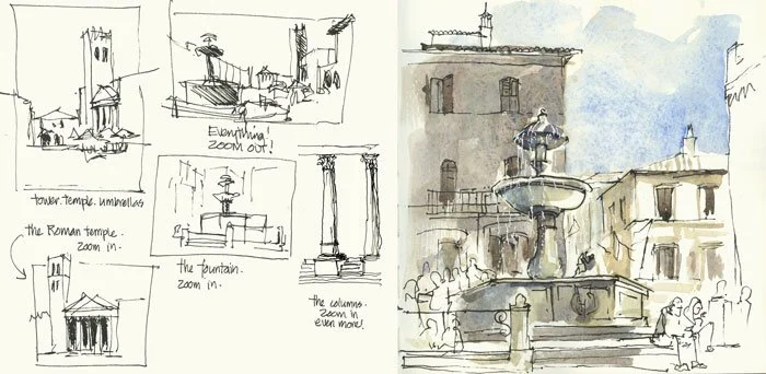
This is an example of thumbnail studies by Liz Steel
Another advantage of thumbnail sketching is it forces me to simplify and not get caught up in the details which I tend to do when the paper is bigger. So that’s a double advantage.
Below is an example of how you can simplify a lot of noisy shapes into believable shapes your brain can understand when you look at them again later. At the time of doing, please be prepared to accept that what you’re doing is a bunch of nonsensical shapes.
The image reference is taken from Pinterest here and is shown below.

The colours we’ll be using in thumbnails is best when its a limited palette, and we will explore one limited palette of grey or blue, you will fully appreciate the versatility of a limited palette at the end of this class.
We will also explore four different sizes of thumbnails to assess which size is best for you. Meanwhile look at Remington Robinson’s work here. I am amazed at the size and the details he could add into such a small space as the back of an altoids mint tin.
The exercises I recommend to do for thumbnail class will be 4 equal sized thumbnails, and to use consistency, strokes and tempo, edge and shape to produce our value study thumbnails.
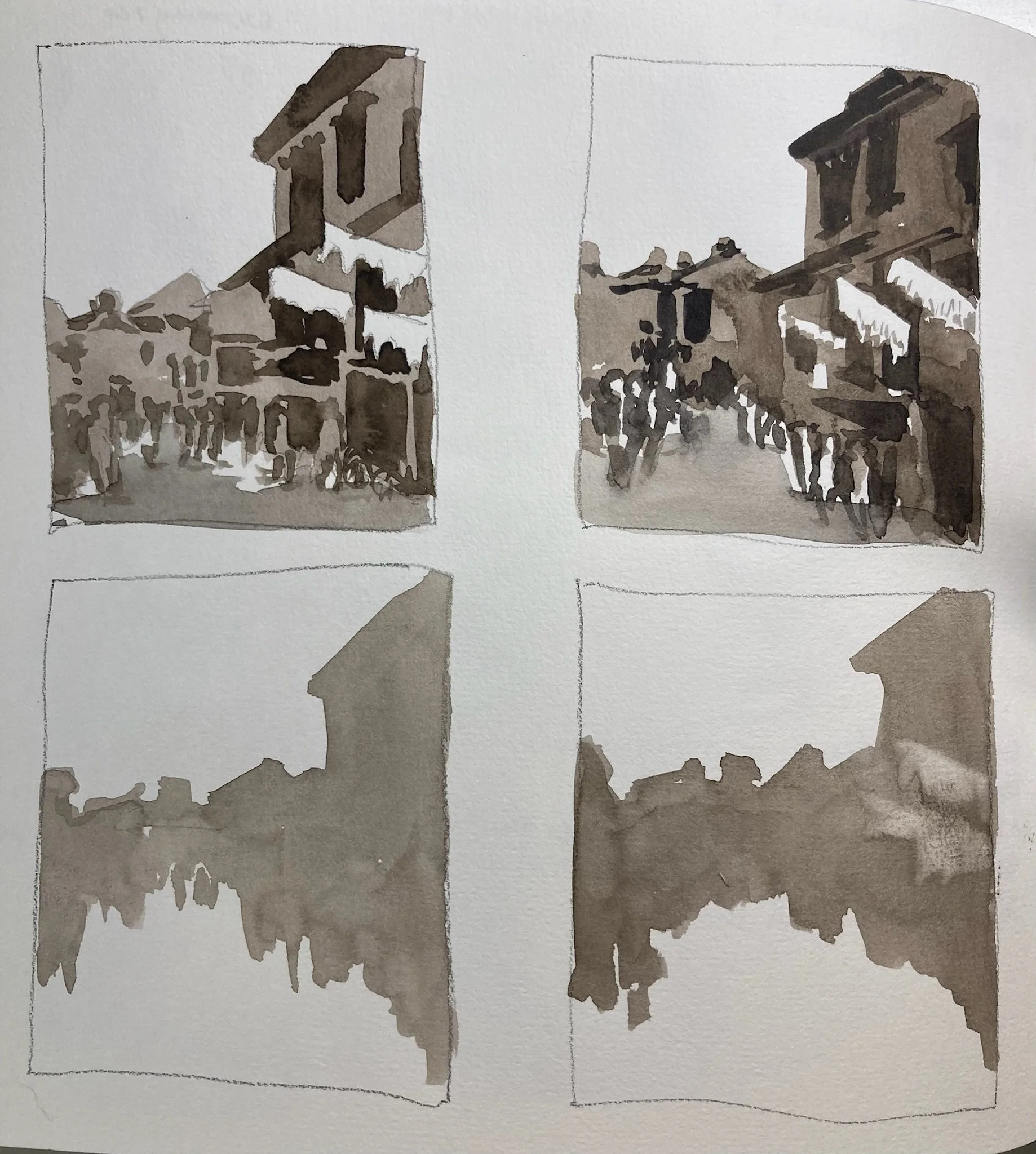
I thought we could look at a grey scale references such as this, for the purpose of this class. This reference at first looks very complex, but look at my attempts above, and see how I use varieties of strokes, consistency, edge and shape. It’s a lot, but don’t let that overwhelm you, the trick is always what seem complex is easier to do that a simple fruit or egg.
Here’s an example of my practice value study thumbnails steps.
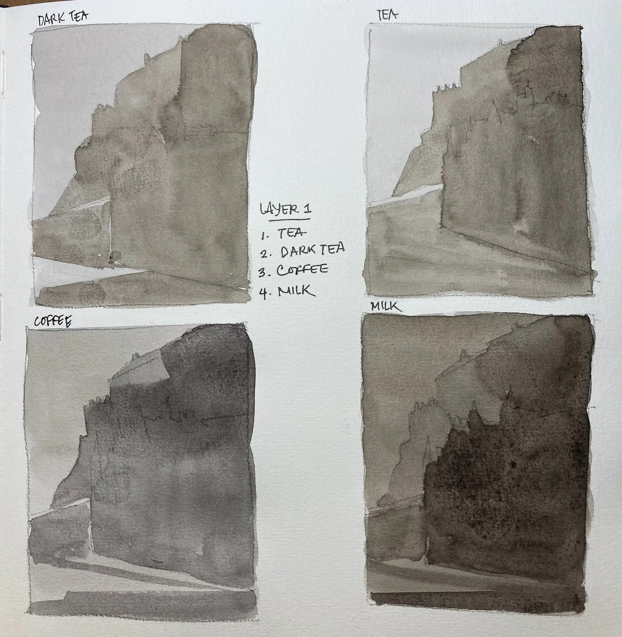
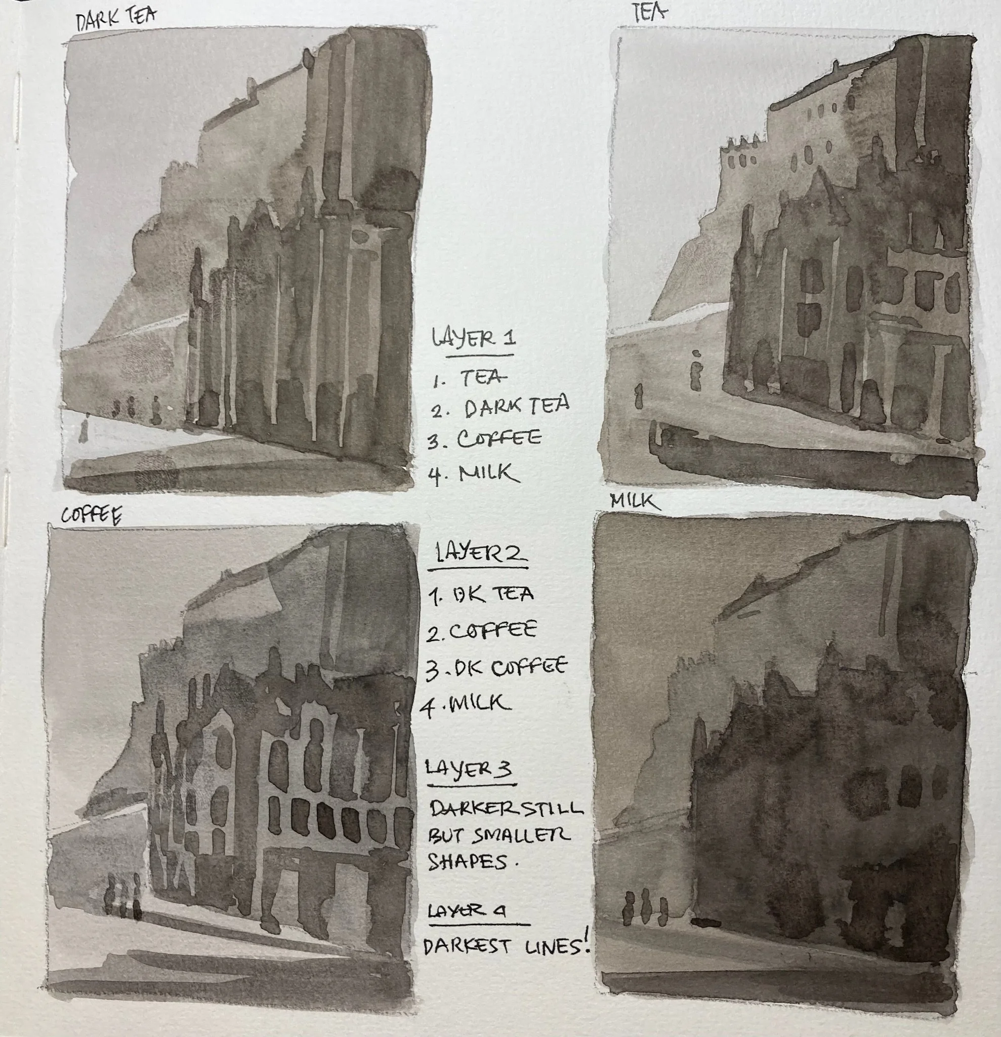
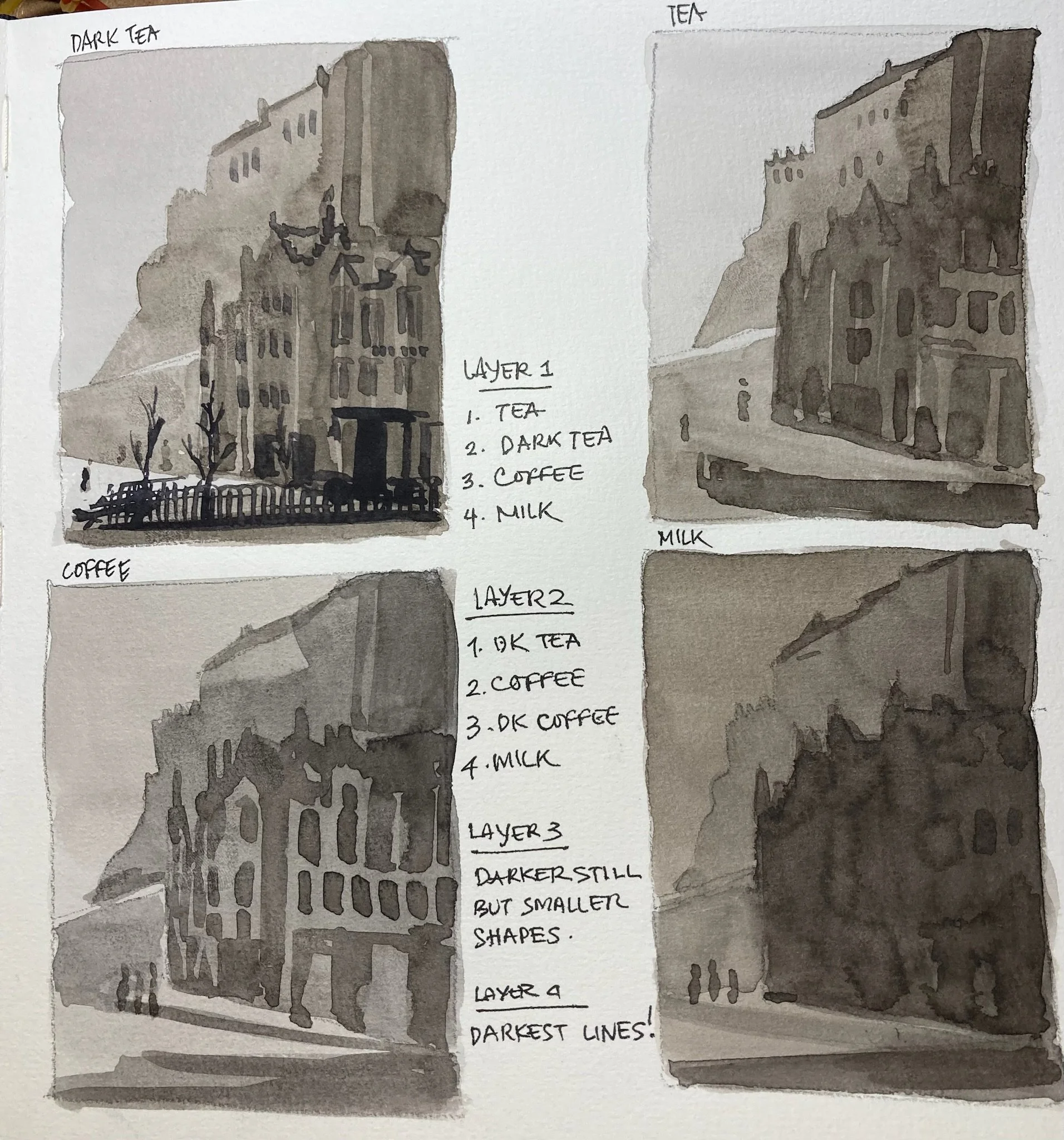
In this group ,I only added the darkest value to the first thumbnail
Values means color consistency. I use 4 different color consistency on each thumbnails.
Wait for that layer to dry completely. And layer the medium value shape. That’s the shape that’s darker than the sky value shape
Don’t worry if you feel your layer is too dark, this is our practice, to allow darker colours to feel too dark but they will dry lighter, so it’s going to be fine.
Why are we doing 4 thumbnails at a time? Each thumbnail is an opportunity to do slightly different shape, slightly different edge, and perhaps more complex value shapes and to give time for the other thumbnails to dry.
Let some layer dry completely, and add in the darker value,
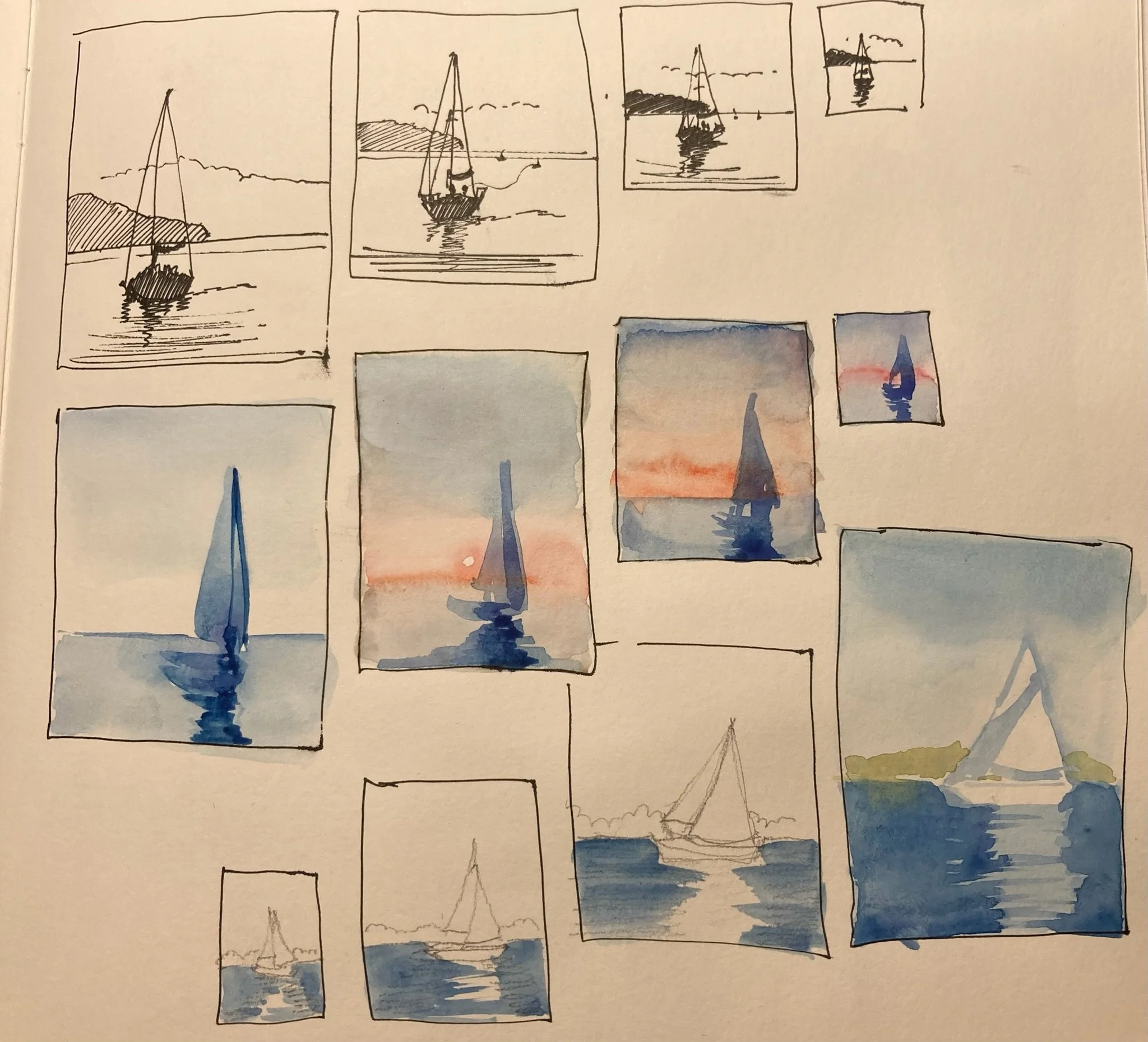
Notice the speed/ tempo of your strokes and minimal strokes is always better when painting big shapes so there’s less feeling of bulk, the work feels fresher if you don’t keep painting over it with a brush too small.
Use a bigger brush on one thumbnails, and limited brush stroke
The value of minimal brush strokes.
This is in relation to thumbnails and also general brush strokes use in watercolours.
Sometimes drawing layers upon layers of brustrokes can make a sketch worse than better, there’s a value in letting watercolor do all the spreading and not forcing the spread with your brush strokes. If you use limited brush strokes, your painting looks fresh.
Overuse of brush strokes can lead to a work feeling heavy and that means you’ve definitely overworked it.
Here’s an example of a work by a student, and the piece I did very quickly with minimal brush strokes of a sunflower arrangement.

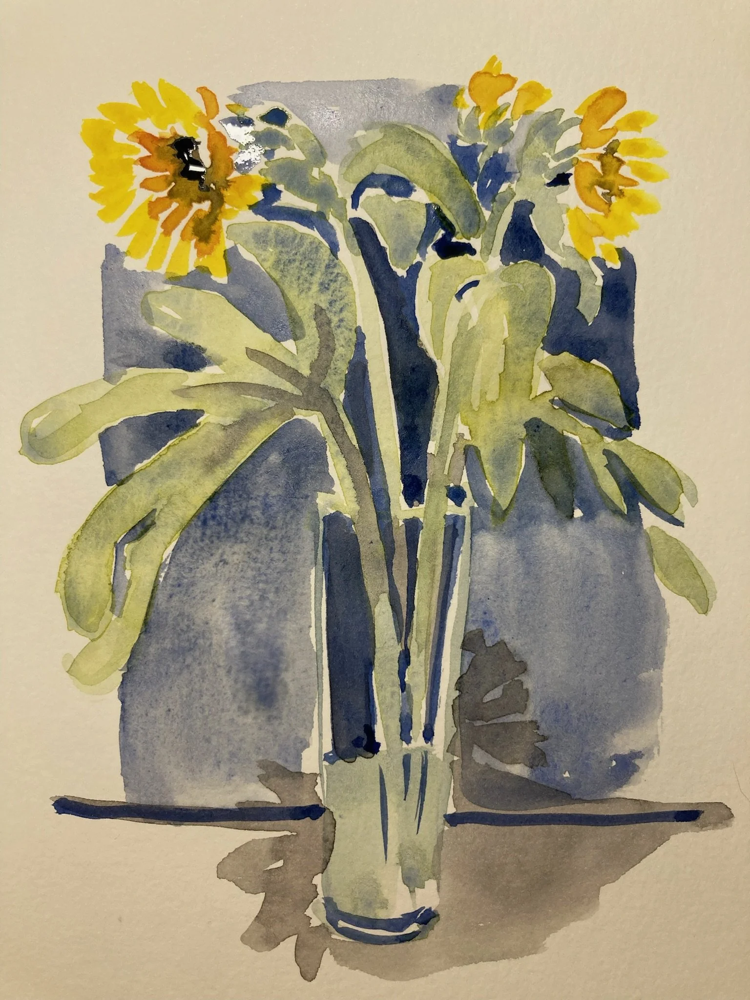
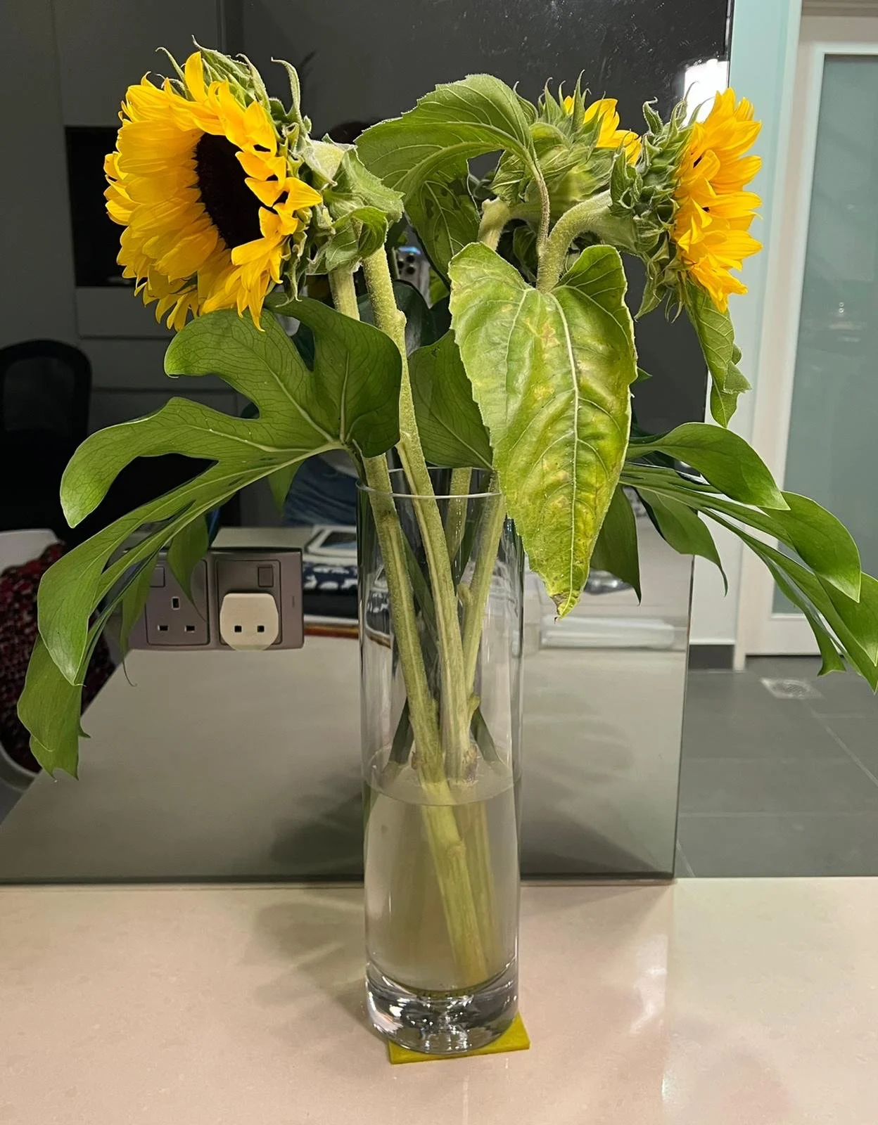
There’s of course more ways than one to do minimal strokes, the above example, was a very loose sketch, which could use a lot more definition. I focused on values from the start, what’s dark behind the flowers can be a good way to push the flowers forward. I did this in a few minutes, with as little brush strokes as possible, and the point is that it reads as the flower arrangements reference. The student’s work is quite good too, but notice the use of brush strokes on the leaves, and how that feels heavy and overworked?
This is the end of the 5 weeks course article posts. Please enjoy yourself in continued learning, and watch out for my next post about those water droplets you’ve been seeing in my IG